A Jem of a Birthday Present

Off the PageI’ve mentioned before that having a creative talent can be a gift and a curse.

During Christmases and birthdays being able to produce some nice creative presents for friends is always better than just buying them a movie or tshirt.

It’s not always a sure thing though and sometimes you decide to do a piece of art for someone and get hit by the creative block freight train that bogs you down…

A friend recently had a birthday and I decided a couple months before to do some artwork for her.  She’s a huge fan of the 80s cartoon show  Jem (as can be seen here and here) and I wanted to do a Jem piece for her.

I had a clear image in my mind of what I wanted it to be…but it took a few swings before I landed on the final…

I wanted to do a “singing” piece, not just a standing there for the poster piece.

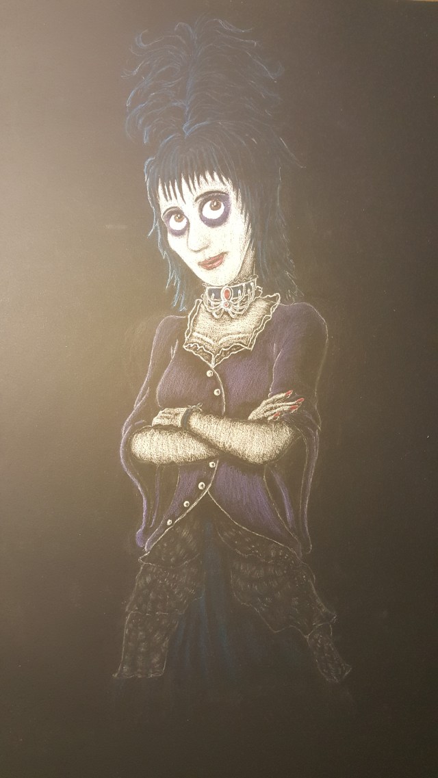
My initial idea was a close up using Halestorm vixen Lzzy Hale as a model.

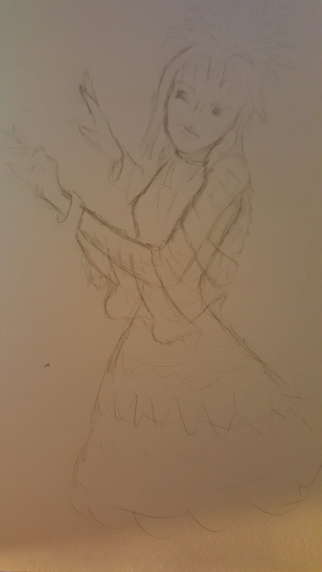
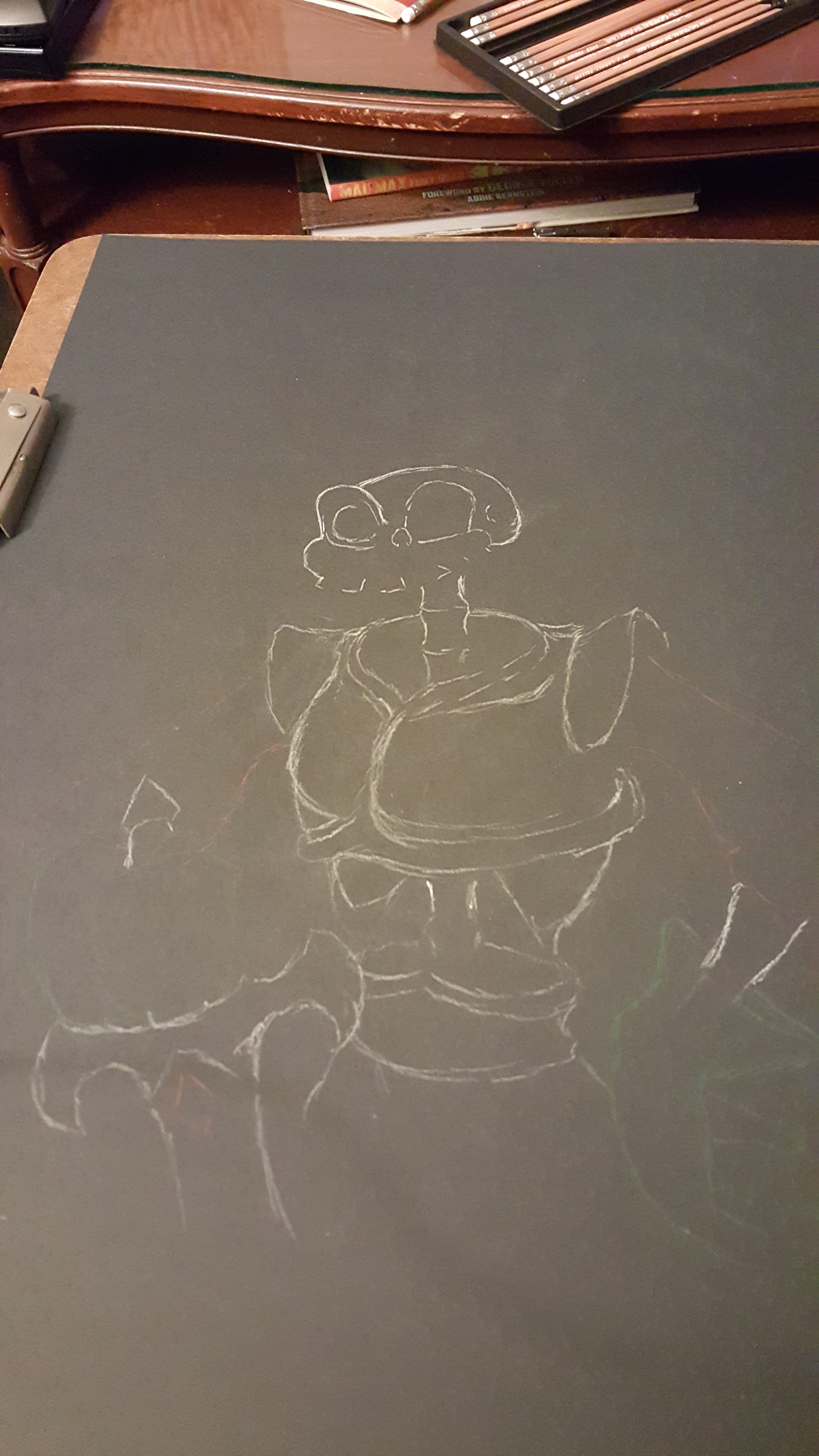
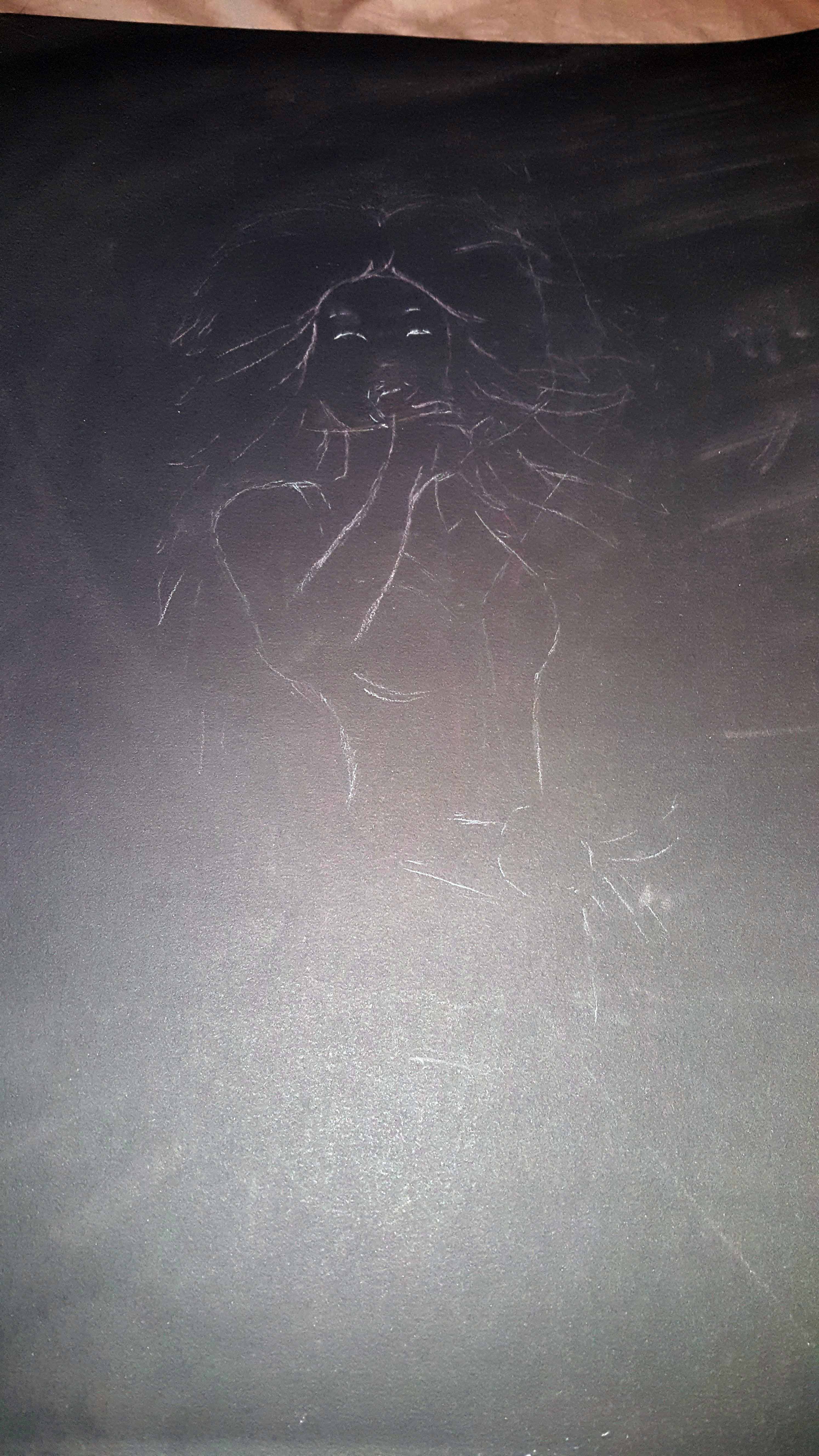
I sketched it out in pencil in my sketchbook before deciding on a medium for the final:

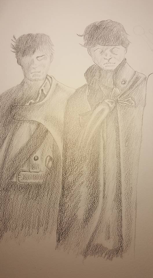
I tried to do it in chalk pastels…but as I progressed through it I didn’t like the look of it.  I definitely wanted the bright pink colors but I wasn’t a fan of the composition…  So I dropped the close up concept and went with a copy of a famous Jem poster…but as I worked through it I considered how senseless it was just to draw a poster…it’s just a copy of existing art.  And scrapped that too…

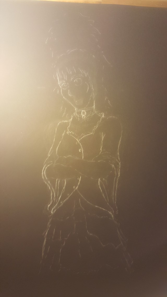
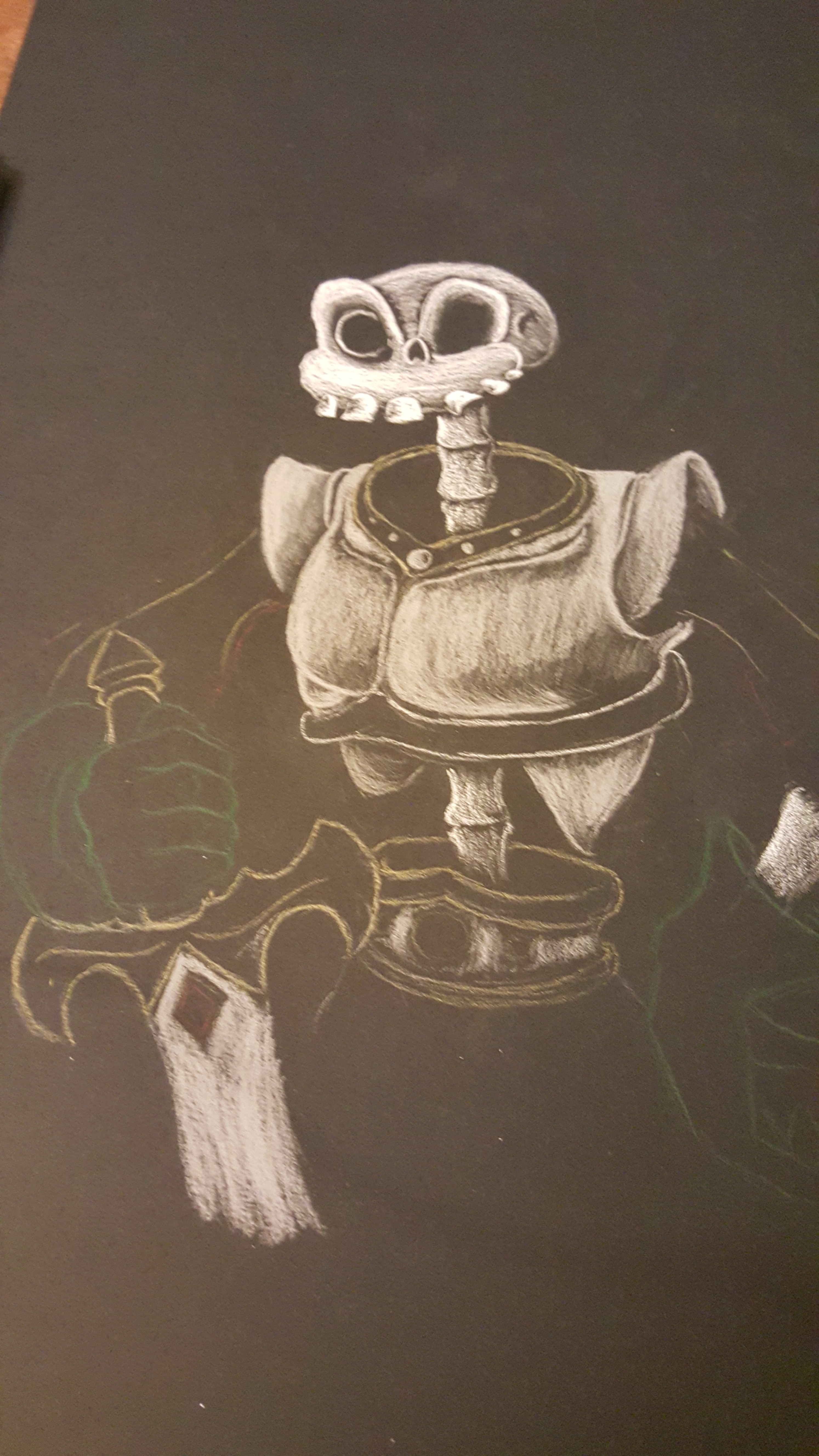
So I scrapped it and thought, “Well I haven’t done any straight up pencil work in a while.  I can add a touch of color to the pink like I did for my World’s End piece.”  So I started on pencils…

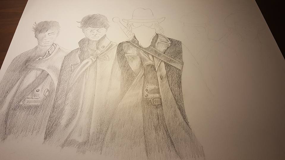
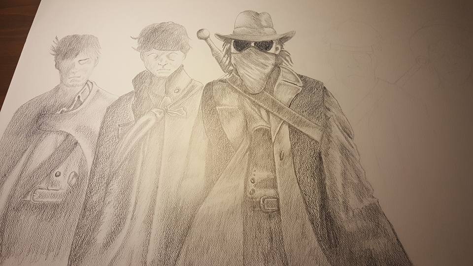
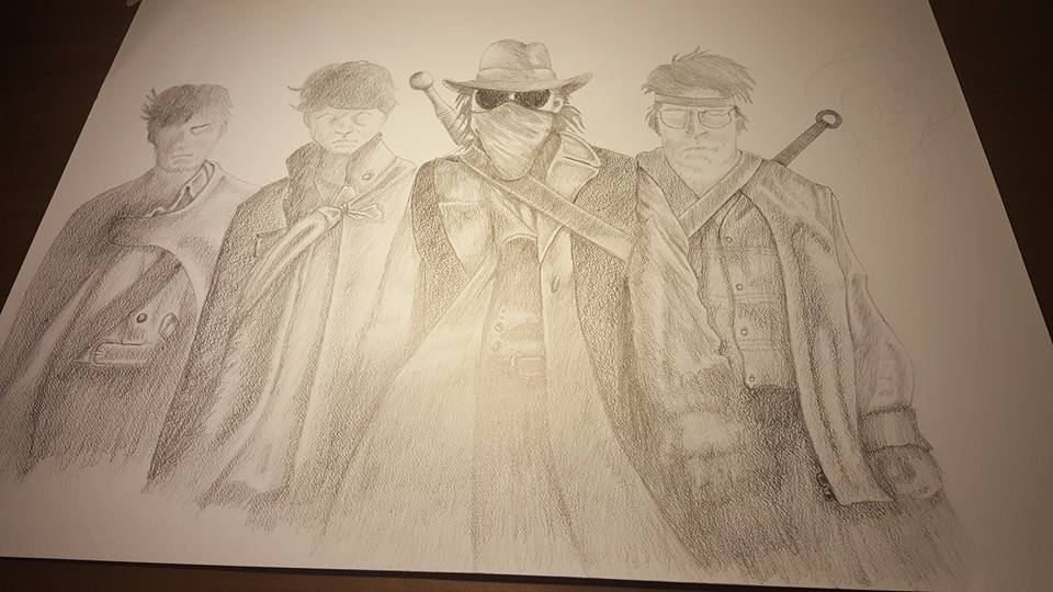
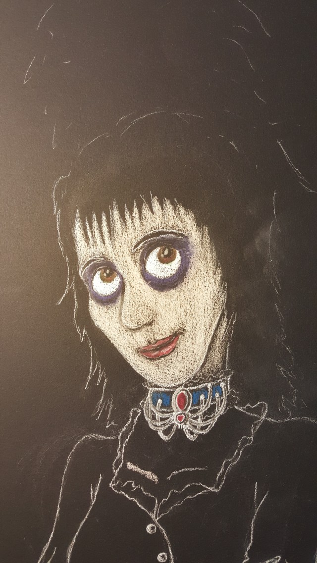
I thought I could do a punk rock or metal Jem…  The issue is Jem’s look is kind of iconic.  If you take her gaudy pink dresses, teased hair, and make up away she isn’t Jem anymore (as the producers of that awful film found out).  So even though I thought the art was better it wasn’t what I wanted to do.  So I scrapped that one.

With the birthday rapidly approaching I was starting to regret painting myself into the “creative” corner for the present.  I couldn’t muster the creativity to do a piece I liked and ended up regretting the choice to try it.

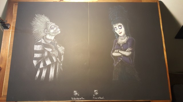
Then one morning I was lounging in bed one Saturday morning scrolling through Facebook and I came across a an ad for a Rick and Morty tshirt showing Rick in the iconic Scott Pilgrim pose.  As soon as I saw it I had the idea, Jem in Scott Pilgrim style.

I thought about the piece while I was at work that day.  I initially struggled with the composition, Pilgrim had his famous Rickenbacker bass.  Rick was holding a cartoon guitar.  I briefly considered just giving Jem a guitar or an 80s keytar, but I know fandoms enough to know you want to stick with accuracy.  I couldn’t give her either of those because canonically Jem doesn’t play either of those instruments in the show…  I eventually landed on having her still singing, but holding the mic cable in the same pose as a guitar player.  Once I had it nailed down I produced this:

The first one of these I was actually happy with.

It was done just in time for the birthday and now hangs in her house.  Always the best part of making art for someone is seeing how the recipient decides to display it!


The World’s End Original Artwork: To Err is Human

Off the PageOne of my favorite movies of the 2000s is Edgar Wright’s The World’s End.  The conclusion of the so-called “Cornetto-Trilogy,” the movie brings together everything Wright, Simon Pegg, Nick Frost, and their acting company learned from their previous experiences; those they’ve completed together and those they’ve completed on their own. It’s hilarious, unique, moving, perfectly cast, wonderfully performed, and masterfully directed.  It’s a terrific film and the best original idea I can recall seeing in a decade or more.

Because of my OCDs I tend to get movies stuck in my head and this can result in binge watching movies or TV shows on repeat.  That was the case with World’s End several weeks ago.  Watching it, then with the writer’s commentary, then the cast commentary, then the technical commentary, then with the trivia subtitles, then just again with all of that behind-the-scenes knowledge, the movie truly got stuck in my head.  I had an idea for a drawing and just had to get it on paper.  This was the scene that stayed with me, along with The Sisters of Mercy song “This Corrosion”:

errmov

I started in light 4H pencil to get the basics down:

errpen01

Then worked left to right to keep the 4B and 6B graphite from smearing too badly as I went:

errpar2 errpen4 errpen4a errpar5

In the end I had to take additional pictures from my Bluray copy of the movie in order to get the costume details accurate.  Each character took around 3 hours each with Gary King taking around 4-5 as he required the most work and it was most important to have his accoutrements correct.

The final version:

errfinal

I decided to add the blue eyes for Gary’s “Blank” mates, which is different from the film but made a more powerful image.  I added the bright red “To Err is Human” the partial Pope reference purposefully misquoted by Gary in his confrontation with the Network and appearing correctly written on a wall in the epilogue.  The quote became the unofficial name of the drawing.

To make perhaps my artistic life, I posted the drawing on Twitter, not expecting too much only to find the next day Edgar Wright himself, my favorite active director, actually liked the Tweet.  I did a bit of minor bragging about this one!

ewtweet


Creative Christmas: I Am Groot

Halfway through the Beetlejuice pictures another image popped into my head.  I watched a ton of Guardians of the Galaxy during the holidays and the idea of drawing a baby Groot was just too tempting to pass up.  It would give me a chance to practice color and see how much I could play with the new medium.

This one actually went so fast I didn’t have a chance to take pictures of the process.  Like many of these I wasn’t used to the methodology so about four times during the drawing I thought I’d ruined it.  I did manage to get a picture of the finished version:

20151206_092516

I didn’t have a brown pastel at the time so I ended up mixing my own.  It worked relatively well even if it came out a bit green.

I added the glowing parts after I finished and found the composition to be a little left-heavy.  Plus it gave me a chance to try something I couldn’t do in pencil.

I was pretty happy with it for a spur-of-the-moment picture.  And it got drawing Groot out of my system!

Creative Christmas: Beetlejuice Lydia

In my last post I described my process in creating a chalk pastel Beetlejuice.  I wanted to do a nice version of Lydia to go along with it, but unlike Beetlejuice I didn’t have a clear image to go on.  Also she’s identifiable but not quite as iconic, so she had to come more from my own head than the Ghost with the Most.

20160110_071749

I originally wanted to go with revulsion but I didn’t like the way it paired with the Beetlejuice.  So I changed it before the final.

20151115_175412

I actually found a picture of “costume ideas” for Lydia cosplayers that I used as a base.

20151116_202901

I was particularly proud of my spider necklace design.

20151122_115126

She ended up looking more like the cartoon version of Lydia than Winona Ryder, but as the artwork was a little cartoony I ended up being ok with it.

20151126_175338

She mostly wears black except for her red wedding dress. Drawing black clothes on black paper is trickier than it seems…

20151126_175353

For a first big piece in chalk and color I was pretty happy with them!

Creative Christmas: Sir Daniel Fortesque

As was said in my RevPub Partner’s Christmas Post creative presents are the best presents.  I decided not to buy random, useless stuff for people this year and do some artwork.

I’m normally a black and white pencil illustrator, but ever since my experience with chalk pastels on Halloween I’ve been eager to try more.  I’ve had random images pop into my head since Halloween and a “classical” portrait of Medi-Evil’s Sir Daniel Fortesque was remarkably vivid and I knew I had to draw this one right away.  Since my friend Mike and I are a huge fan of the series, I knew this was going to be his present:

20151219_195246

Roughing out images for chalk pastels is super fast.  I don’t know why it so different from pencils, but for some reason I can get a rough outline done in chalk in a matter of minutes and have it be relatively accurate.

20151219_203357

During nearly every chalk pastel I’ve done there is a point where I think “Oh blessed Omnissiah, I’ve ruined it…”  This was the point in this one.  I didn’t have a brown pastel, so I was mixing my own.  At this stage to me everything looked wrong.  I learned on previous images that continuing and correcting as you go works very well.  I don’t erase as much in chalk as the medium is easier to cover with subsequent layers.

20151219_211156

At this point the corrections started to make me feel better…  I always draw the eyes in last but I was pretty happy it was all going to work out.  As an aside, I’ve had a clip on drawing board for years.  It’s worn and damaged but it’s served me well.  Especially for medium-sized pieces.

20151219_215358Final Sir Dan.  I decided not to overly detail his leg armor so it didn’t draw away from his upper body.  I was incredibly happy with this one, and it made for a great Christmas to a fellow Medi-Evil fan.  Just shy of a NEW installment in the series.

The Ugee Drawing Screen

In my last post I discussed how the effective writing and delivery of Jim Sterling inspires others in their creativity.  This week is a case in point.

I have had a hard time moving from my beloved paper artwork in this digital age.  I’ve tried drawing, scanning the pencils, then vectoring the pencil art.  It didn’t work well.  I’ve also tried having the artwork inked, then scanning it and vectoring from there.  That tended to work better, but still required about 4-6 steps before I could get it in a format to be edited digitally. I’ve tried two versions of Wacom style tablets where a tablet you hold controls a cursor on the screen.  That had marginal success, but I had a lot of trouble making the connection between the pen touching a black surface to a cursor making precise actions on screen.  It went ok but I’m not good enough at it to produce even close to what I do on paper. The next step was an Android tablet with software that simulates graphic design.  It sounded good because it would allow me to draw right on the screen.  The downside was the only styluses I could find were about the size of an eraser.  Trying to do precise markings was out of the question and even trying to tell where they stylus was touching the screen wasn’t always easy to determine.

During a book signing for Matthew Inman aka The Oatmeal he mentioned he uses a Wacom Cintiq and that sounded perfect.  It essentially allows you to draw right on the screen with a pencil-sized stylus you’re your choice of graphic software.

Unfortunately since I haven’t won any lotteries recently I couldn’t get one of those…so I began browsing off brands.
After much consideration I landed on the Ugee drawing screen and it has solved my digitization woes. The first piece of art I produced was my Jim F’N Sterling Son from my last post.
image

I drew into Manga Studio as I preferred the look and feel of its interface as opposed to Illustrator’s.  It just felt more like a real pencil and could be adjusted with sliders to be lighter or darker, as though I was picking a different kind of lead.

After doing the “pencils” in Manga Studio I imported the pencil art into Illustrator, created a layer, and “inked” using Illustrator’s calligraphy tool.  Probably not the best but it worked for my first effort. I was pretty impressed with what could be done relatively quickly, from pencil to colored art took only a couple hours.
image

The Ugee has my approval, its drivers loaded perfectly, it has a large drawing surface, and has an excellent stand.  The only “complaint” is that it can wash out a bit at the wrong angle, but that’s not a big problem when working on a project, just when using it as a regular screen.

As a side note, I’m hoping Jim recovers quickly.  Here’s hoping he’s back on his feet and giving them hell as soon as possible.  We need him in the trenches!

My original Jim Sterling post